Website Design

Registering dissent about registering on websites

Members of Specification Consultants in Independent Practice (SCIP) are in charge of the specifications of billions of dollars in construction annually. Their ranks also include thought leaders with enormous influence in our industry. When they speak, building product manufacturers would be wise to listen. And this is the message they announced at the recent Construct 2014/CSI Conference last week in Baltimore:
 Don't ask us to register before getting access to your website.

Their objection is that the registration process takes valuable time, asks for information that is not germane to the issues at hand, is an intrusion into their privacy, can lead to unwanted sales calls, and may harm a building owner's need for confidentiality in a real estate or construction transaction.

Ready access to information is the life blood of design and construction, and the registration process hinders that.  Specs are often prepared under the pressure of deadlines and many architects will simply go to another site if it is difficult to find the info they need with just a few keystrokes.

Some manufacturers claim that registration prevents competitors from accessing trade secrets. Yet every building product manufacturer I have ever served had figured out how to get into your website. True trade secrets, of course, require security, and names and addresses have to be collected when requesting samples. What SCIP members are objecting being asked to register to see essential product selection information. 
Typical of SCIP members, Mitch Lawrence (left) works for a Altoon Partners, an architectural firm active on three continents. Stephan Nash (right) is a consultant writing specs for many of the major Hawaii-based architects and projects. If you want their business, make it easy for them to get onto your website.
There is a better way to collect data: make a compelling offer.  This could be an entry into a competition, coupons for discounts, vouchers for special events, registration for a webinar, or other promotional items. When I worked at Ceilings Plus, for example, we offered to send an "Idea Book" with a portfolio of design ideas, finish samples, and design tools in a neat, compact package. The trick is to offer something that will be of interest to bona fide prospects but of no interest to pursuing swag.

Please share this page with your web designer.
-------------------------------------------------------
A friend in the industry adds:

"What is even more infuriating is to try to go back to a manufacturer's website that you may have registered at years before... and discover that you need to try and remember the password you used... and the site won't allow you to access unless you remember that password!! This usually happens at 10PM when you're trying to finish up a project specification and there's no way to call the manufacturer!!"

A comment about this post, from a registered architect, says:

"I absolutely agree with the hassle of registering on a manufacturer's web site to get information. Proprietary information - I can't imagine a manufacturer is so stupid to allow me to access their proprietary information off of a web site so the excuse that it protects them from competitors is, on the face of it, absurd. If possible I switch to a competitors web site rather than register. AND I remember when I write specifications for a project - if you are going to make it difficult for me (register OR charge for information such as referenced ASTM standards or minor verification/selection samples), I simply do not include that product/manufacturer in the list of approved equals."

A variation on the registration them:

"I was researching a fire curtain. When I clicked on a link labeld "Brochure", the link opened an email browser so I could send a request. That is just as much a nuisance as having to register.  Pooh on you!"

A Quick Response from an Exhibitor at Trade Show


Lynn Javoroski FCSI CCS posted this on the CSI LinkedIn Group:  "Did y'all know that "No registration" pins were handed out at CONSTRUCT2104? And that the exhibitors were asking about it? Some of us received thanks from ClarkDietrich with a picture of the button and 'ENJOY THE ACCESS WITHOUT THE OBLIGATION. With no registration required, ClarkDietrich offers you access to a wealth of product information and tools' written next to the picture. At least someone listened."  

I APPLAUD CLARKDIETRICH FOR ITS QUICK THINKING ON THE TRADE SHOW FLOOR.

Lynn wrote me about how the No Registration button came about:

"What started this whole thing off at Construct was this: I went to a manufacturer's website needing to know in what color(s) their laboratory countertops were available. When I clicked on the "color" button, a pop-up appeared and stated 'You are not authorized to view this information without registering'. Needless to say, they were removed from my spec. Sometime afterwards, I was corresponding with Colin [Colin Gilman publishes 4spec.com] and mentioned it; somehow we got to the idea of buttons and he said "send me the graphic and I'll have them made up and shipped to you". So I did and he did. "
 
------------------------------------------------------
See more discussion about this topic at CSI Group on LinkedIn.

Web Design: A compelling case for larger fonts

We've probably said it before. We'll probably say it again. But this article says it very well: Make your web site legible.

16 Pixels For Body Copy. Anything Less Is A Costly Mistake.

Consider your audience. Gray-on-gray eight-pixel type is beautiful and looks like an architecture magazine. But if you want your audience to understand your message, larger and higher-contrast is the way to go. The article itself proves the point.

Proofread or Perish

Your 2nd grade teacher was right: proofreading your stuff is an absolute must.  Othawise, your risk having you’re busness appear solppy an unresponsible, or worse, even ignorent.

Which stuff am I talking about?  Every single thing you publish.  Your product literature, your ads, your catalogs, your website, even your material safety data sheet (MSDS).

I was recently reading a web page about a coloring product.  The manufacturer was boasting that the product “is available in a full pallet of pigments.”  Which is good, I suppose, if you’re a volume user who buys pigments by the pallet.

But if you’re an artist who likes many color choices, you might prefer a full palette of pigments.

I thought to myself, "the code monkey who put together this website isn’t very literate."  Then I pulled up the technical data sheet for the product, and found the same language there.  It wasn’t that feckless web designer after all, it was the manufacturer!

Another technical data sheet I recently downloaded was simply incomplete.  Two sections were blank except for notes in red, notes asking if this info should be a copied from the sheet for a related product.  Nobody had checked the file that went online.

To be fair, the file was dated several years ago and nobody had ever said a word about it, so we might conclude it wasn’t getting read very much anyway.  Maybe this slip-up hadn’t impacted their reputation heavily.  But it easily could have.

I see typos and grammatical mistakes every day on manufacturer’s websites and in their product literature.  It makes a bad impression on me, but it could have a more serious impact on architectural outreach.  Specifiers depend on the accuracy of product information when they select products for a project.   Do you really want to shake their confidence in your information?

Now that you’ve seen the light and are determined to proofread everything, a hint: it is very difficult for the writer of a piece to proofread it well.  She knows what it should say, which makes it easy for her to miss what is actually printed.  Somebody else should proof it.  Ideally, the writer should read it aloud to somebody else who follows on a printed copy and proofs it.


QR Codes Go Mainstream

As we have been predicting, QR codes are arriving at some sort of critical mass in the US, and suddenly, you see them everywhere.  Home depot has them on store displays.  They’re on the news.  A headstone maker is putting them on gravestones.

They may look like a maze puzzle to you, but to a smart phone with a (free) QR-reader app, they are a link to information, like a bar code on steroids.

Most current applications simply use the code to link to a website.  At Home Depot, a QR code attached to a display model links you to the Home Depot web page about the product. The gravestone-maker similarly uses the QR code to link to a web page about the deceased.  (The code, etched in stone, will probably outlast the web page.)


It is possible to pack plain text directly into a QR code, too. For example, the really dense QR code depicted here contains the first two paragraphs of this post.

What is it worth to building products manufacturers?  For starters, you could link all your product data and online instruction videos to a QR code right on your product packaging.  A contractor shopping at the distributor’s warehouse could find out everything he needs from the most accurate source: you.  On the jobsite, he could access instant video instruction for workers. You could link him to customer service and technical support just as easily.

You can put a QR on your business card, too, for direct link to your website.

For the time being, while QR codes are still a novelty, they offer tempting guerrilla marketing opportunities.  People will be curious and scan them just to find out what they link to.  Print them on cards and leave a few at big job sites, on Home Depot shelves, at union halls.  You can print them on stickers and find interesting places to attach them: a hard hat, a tool box, a product package.

They won’t be novel for long, though.  Acceptance is moving rapidly.

10 Best New Building Products of 2010

At the end of each year, the staff at Chusid Associates nominates and votes on its list of the Ten Best New Building Products of the year.  Our intention was to blog about all ten, but we got busy and only managed to write about a few of the winners. Without delaying the project further, here is our truncated list:

The pace of innovation continues. The tough economic times are actually proving a boon to some companies, as they use the opportunity for research and launching new products that, in the continual press of sales during a good year, would normally get buried. Several of this year's entries are innovations on ages-old problems, while others represent the intersection of several cutting-edge technological developments. A few were included not because the actual products were significant, but because of the trends they represent.

1. Plasma Lighting: Solid state lighting, in the form of LEDs, have been a major trend for the past few years. Now plasma lighting is taking the spotlight, offering in some cases twice the lumens per Watt of LEDs. Right now most of the plasma lighting available is for stadium and street lamp-sized installations, but miniaturization to commercial and industrial scale seems inevitable.

Multiquip's H2LT Hydrogen Fueled Light Tower drew a lot of attention at World of Concrete for combining low-energy, high-intensity light with quiet, low-polluting hydrogen fuel cells. The plasma light bulb produces 22,000 lumens while consuming only 255 watts, with a life expectancy of up to 50,000 hours. Beyond its energy efficiency, the tower made our list for one simple reason: it is sparking imaginations. At the show, people were walking away from the Multiquip booth discussing new ways and places they could use this technology, sewing the seeds for the next generation of innovations.

This all-glass wall is energy efficient.
2. Phase-Change Insulated Glass: Another ripe field for innovations is combining multiple successful technologies into a single high-performing system. This becomes especially important in sustainable design when building systems often need a higher level of flexibly to meet multiple design objectives simultaneously; natural daylighting is advantageous, for example, but too much interferes with the building's thermal performance and energy use.


Glass-X, from Greenlight Glass, addresses exactly this problem. The core of the system is phase-changing glass that stores or releases thermal energy in the process of converting from solid to liquid states. Glass-X controls thermal transfer, essentially creating virtual thermal mass to help warm or cool the interior as needed. A prism system takes advantage of seasonal changes in the sun's position to reflect hot summer light, while allowing more light, and heat, transfer in winter months.

Glass is one of our favorite building materials around the office; the amount of versatility and innovation in glass construction is staggering, and the trend looks set to continue for the next few decades. The next winner is another glass product.


3. Bird-Visible Glass: When I was five I once ran full-speed into a closed glass door, face first, so I have a lot of sympathy for birds flying into windows. The problem is so prevalent that it has become embedded in our culture; birds hitting windows is an instantly recognizable slapstick troupe. But the real-world side is not funny; estimates are that almost 1 billion birds are killed by window collisions in the US each year.

Ornalux glass has special ultraviolet patterns that are visible to birds, but not detectable by the human eye. This means birds see the window and identify it as an obstacle, and humans get to enjoy natural lighting and an unobstructed view.


Click here for our 2009 list. And stay tuned for our best of 2011 list.

How NOT to label images

As connection speeds and hard drives have improved, the type of media people look for online has changed. The early 'net was all about text (hypertext), but now people can access, and want, more images. It is neither coincidence or accident that every successful social medium incorporates some form of image sharing. Images are especially important in construction, whether project photos or technical drawings. They illustrate, showcase, and explain products in ways difficult to achieve using just pages full of text and data. This means it is now as important for search engines to find your pictures as your website.

So why do I keep seeing pages that use images like this:


This came from an email newsletter; my email client only downloads images with manual approval, so when I opened the message this is what I saw. The problem is all the images had generic alt text - "Placeholder image" - instead of useful names. 

Usually alt text only comes up when you hover the mouse cursor over an image, but it will also display if, for some reason, the image does not load. This means that if there is no alt text, or bad alt text, and the image is broken or missing, viewers have no way to know what was there. This email would work better if the alt text said, "Rotary hammer in action" or "Vacuum excavator close-up". That text is interesting, and makes me want to click through.

This example comes from an email, not a website, but the basic principal remains the same: Alt text is another way to get readers, and search engines, interested in your images. Adding alt text is fairly easy; most content management systems should provide a space for alt text when you upload an image. If not, it requires a small addition to the HTML that defines the image. Either way, if your webmaster doesn't know how to do this, get a new webmaster.

How NOT to post technical data

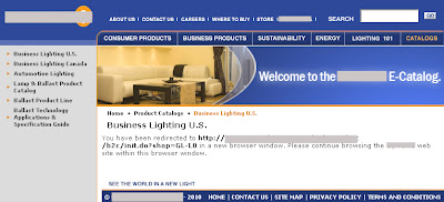
While looking for photometric information on HID lighting, I visited the website of a major producer. After searching the site for half an hour, I called their technical service line. Their representative was very helpful, and told me where to look on the webpage. When I followed her instructions, I found this:

Names and identifying brand information removed where possible

The text is a little hard to read in this screen shot; it says:
"You have been redirected to http://XXXX/b2c/init.do?shop=GL-L0 in a new browser window. Please continue browsing the XXXX  web site within this browser window." 
What you do not see is the technical information I needed, which means, were I a designer, they would have lost the sale. Why not? Because I use a pop-up blocker when I surf the net. The customer service rep recommended I turn the blocker off to browse their site.

Yeah; right. Let me turn off my virus protection while I'm at it.

Here's the problem: pop-up ads are a type of spam. Not legally, yet, but in terms of how they effect the web browsing experience, and how people react to them. They are also among the easiest types of spam to block; websites usually need to ask permission to open a new window, and pop-up blockers are set to always respond "no".

Not everyone uses pop-up blockers, but the number that do is steadily growing. More importantly, most, if not all, early adopters use them. In other words, the people most likely to be searching for non-established, high-performance new building products.

This is the same problem I have with Flash intros to websites; why are you putting a potential technological barrier between your customer and your product?

The advantage to using a pop-up is site visitors can access new resources without using their place on the current page. This is most useful when the new resource exists outside of your site. For example, if I wanted to show you something on the Concrete Decor Show & Spring Training blog I would set it to open in a new window because I want to share their site but do not want you to leave mine. This lighting company's use of pop-ups does not make sense, because the technical information is still within their website.

Pop-ups are one of those design tools that currently live in a grey area. Using them is not "wrong", but they are annoying enough, poorly used, that it almost does not matter. If you feel your website benefits from using pop-ups sparingly, use them. But never hide important information behind one.

When tablets meet your website

Many companies are still working on designing a mobile version of their website, but the internet, being a creature that can never sleep or stand still, is already moving on. This time to tablets like Apple's iPad.

With the new technology comes a host of new formatting issues. In many cases your standard website (the "desktop version" as it is now being called), while slightly too big, will work just fine on a tablet; for other websites, or tablets with smaller screens, the mobile version is better, if slightly too small.

As Goldilocks discovered, though, "too big" and "too little" are different from "just right".

Putting a mobile-scale layout onto a tablet's larger screen tends to look ridiculous, as many app designers learned when they tried to export existing iPhone apps directly to the iPad. And using your desktop website might not work if it is designed to take advantage of larger screens, Flash, complex forms, or other hardware or software resources common to a desktop computer that may be lacking on a tablet.

ReadWriteWeb has a good checklist to help you test your existing website on a tablet from John Paul Titlow. First step, get a tablet to work with (in case you're still looking for an excuse). Then, go through these steps (and read the full article for further details):

  1. Test your site on a tablet
  2. Simplify the layout
  3. Ditch the Flash
  4. Check your form fields
  5. Make the user interface app-like
Tellingly, this list is very similar to the checklist for testing a mobile website. Or a desktop website, for that matter, substituting the various browsers for tablets and smartphones. In fact, a couple of these points are becoming standard best practices for all web design: Flash is no longer a good option for site navigation (use it for flavor only), and simpler layouts tend, in almost every case, to work better and make navigation easier. Or, as Titlow puts it: 
If simplicity is important in standard Web design, it's even more critical in designing for the iPad and similar devices. As a rule of thumb, strip out any elements of a page's layout that are not absolutely essential. Consider dropping that three-column layout for two columns. In many cases, cleaning up your site's design for the benefit of tablet browsers will have the added advantage of making the desktop browsing experience better.
Titlow recommends, resources permitting, creating a dedicated tablet-specific website. That's probably somewhat overkill, especially since tablet standards are still developing, and now describe devices ranging in size from "slightly bigger than an iPhone" to "slightly smaller than a laptop", with a wide variety of aspect ratios, browser combinations, and technical capabilities.

More likely your company will be fine making a few modifications to the existing website, and providing tablet-optimized versions of the resources your clients are most likely to need while away from their desks.

Does your documentation suck?

Beyond features & benefits, beyond good relationship building, beyond even budgetary restraints, sometimes your customers choose a product based on a single reason: they go with the company that offers the best documentation.

Over at the Mindtouch blog, Mark Fidelman suggests It’s Not Your Product, Your Documentation Just Sucks.
Do we really have to wade through your 400 page text-based manual you’ve posted online in order to find out why an error keeps us from using your software? Worse, when we finally find the answer it’s incomplete. So what do we do? A Google search and find the answer elsewhere.
Great advice, and a well thought-out post (although the end turns a bit into a sales pitch for "customer experience" software). And especially important to remember in the construction industry.

Mark makes the case that many companies will blame every department for the problem (It's a sales problem! No, marketing! No, tech support!) before looking at their documentation. Based on what I've seen in the building product industry, I would agree. Just last month at World of Concrete, a dozen companies told me they were having trouble reaching architects, but they knew it wasn't their guide spec because they've been using the same "tried and true" document for over three decades!

Fine, but is it possible that in the past 30 years your product has changed a little bit? Or the way people search for information is slightly different? If so, then maybe it's time you update your technical documentation for the new millennium.

Even many companies that have good, meaning functional, documentation miss some important opportunities. Starting with a simple one: did you make it possible for clients to include your documentation in their specs, or easy? Did you provide data or answers?

From Mark's post:
Most organizations are optimized for short term revenue growth not in building a sustainable relationship with their customers.

That may have worked in a pre-internet world, but it’s not going to fly now. Why? Because your prospective customers are going elsewhere for support. That elsewhere may be your competition.
The move to digital by the construction world has been slower than the mainstream business community, but it is happening. There is a real perception now that finding the information online is "faster" than a phone call or email. And that's true, if your site is structured well enough that the first search finds the needed information. If not, then your client is going to waste a lot of time finding it. Or they will call, but only after they've become frustrated.

Which means that having good documentation does not mean just print documentation. It means posting it online, and understanding that digital media is used differently than print. Posting that 400 page pdf Mark describes is functionally the same as posting nothing at all.

Put Dates on Product Literature

The following was first published nearly 20 years ago. While it addresses printed product literature, the same recommendations apply to online product literature.

When I asked an architect friend to critique my product literature, he said I should mark each piece with a date of issue. Since no one ever told me this before, I would like your opinion. -S.K., President

If your friend's experience is like mine, he is deluged with new catalogs every year. It is frustrating to have two slightly different versions of a catalog and not know which is more recent. Building-product literature should clearly indicate the date it is issued.

Some manufacturers mark literature with a form number indicating an issue date in code. However, you cannot depend on the specifier or contractor to translate your code. It is better to identify the month and year clearly in a prominent location such as the bottom of a data sheet. It may even be appropriate to state the date of superseded issues, for instance: "Effective May 1991 (supersedes August 1989)."

Some manufacturers fear that dating their literature will out-date it more quickly. But without an issue date, a specifier is likely to assume that your product is old until proven recent. When this happens he may call you -- or may select another product with more reliable dating. In either case, you have increased his uncertainty about your product.

Dating literature also helps your product liability management. By alerting a specifier to the date of publication, you are sharing responsibility with your customer to determine whether or not a piece of literature is acceptably current. When you do not provide that information, you may have increased liability for conforming to claims made in old product literature.

Copyright dates alone do not provide sufficient information to establish issue date. That's because several versions of the same document can be issued in a single year. Also, literature may he issued in preparation for a change that may not take effect until the following year.

Clearly dated literature makes it easier to discuss products over the telephone and to verify that each party is referring to the same data sheet. Dates also make it easier to refer to specific pieces of literature in a specification, contract, or shop drawing submittal. A dating program should be implemented during the normal revision or reprinting process.

Have a question you'd like us to answer?
Send an email to michaelchusid@chusid.com 

By Michael Chusid
Originally published in Construction Marketing Today, Copyright © 1992

Websites without Phone Numbers

If you want to do business, make it easy for your customers or prospects to find you.

That would seem to be obvious. Yet many building product websites do not list phone numbers or email contacts.

Case in point:  www.BoralBrick.com.  Boral is one of the largest brick manufacturers in North America. Yet their website does not list a phone number or email address on the front page or any of the customary, obvious locations. Even their Contact Us page omits contact info. It has just a form that I can use to send them an email -- if I am willing to give them all my contact info. Some calls are too urgent to wait until someone responds via email, and their form does not allow me to attach documents, copy others, or get a copy for my records.

While it is probably just a oversight, they even omit their phone number where they intended it to be. Their Privacy Policy page provides corporate boilerplate saying:
How To Contact Us
Should you have other questions or concerns about these privacy policies, please call us at [phone number] or send us an email at [email address].
After several minutes of searching, I did find their phone number -- at the bottom of a press release. But how many potential customers would have given up the search and moved on to another supplier's site?

For reference, Boral Brick can be reached at 800-5-BORAL-5.


------------
By the way, spelling out phone numbers is cute and can be memorable, but it does not work anymore. Few mobile phones have letters associated with numerals on the "dial" pad anymore.

Your web site's first impression

Your web site's first impression just got more important than ever. Google's Instant Preview allows users to see a small screen preview of your web site before they click through. Take a look at copyblogger's post on the subject:
With Instant Preview, potential visitors are going to make a judgment about whether or not to visit your site without even reading the content. It’s too small to see in the pop up window. They’re going to decide based purely on — (drumroll, please) — design.

In building product marketing, the visual impact of your site was always important. But now that architects can leaf through a pile of online "brochures" and only open the most attractive ones, the pressure is on. In the preview, designers can see the shapes and colors of your site, the headlines, and the visual style of your text, but none of the small words. Even on my 24" monitor, the preview is smaller than the screen of my iPhone. And sure enough, the site I previewed had a Flash-based image, front and center, that shows up in the preview as a gray box. Give Google Instant Preview a try, and see for yourself how your site appears.


The good news? Changes you make to create a better Instant Preview are also smart changes that improve the full-size impact of your site and the mobile view of your site. And the other good news? Chusid Associates can help you choose which elements to emphasize, to give your site the visual impact to survive the preview.

A Green Virtual Trade Show

A trade show without travel does sound like an environmentally sound idea. Yet can a digital forum, a "virtual trade show," really provide the type of hands-on experience that a trade show provides?

Hanley Wood (HW) proposes to find out. They have partnered with a digital technology group to promote GreenExpo365.com, an "online community and virtual trade show."

The website is clearly advertising driven. That in itself is not a bad thing as most trade shows try to part manufacturers from their money. But can such an online forum really form a "community" of users? USGBC, CSI, AIA, and other organizations already offer real communities. Their online components are adjuncts to committees, chapter meetings, and real trade shows.

Here is an excerpt from an HW press release:

Starting in 2011, the publisher... will provide GreenExpo365.com users with increased access to green building and design resources and top-tier design and building industry experts. “GreenExpo365.com’s on-demand, community-focused platform is a natural extension of our green building information strategy,” adds Peter Goldstone, President of Hanley Wood. “Through this interactive site, we’ll be able to better help others increase their knowledge of environmentally responsible building practices and make well-educated decisions in the marketplace.”

The award-winning GreenExpo365.com site is a resource for architects, builders, remodelers, dealers, code officials, manufacturers and others interested in green building design and construction. It offers quarterly “live” events in an online trade show format that includes expert presenters and exhibitors, bi-weekly webinars on a host of green building topics, on-demand continuing education courses registered with the American Institute of Architects (AIA), and 24/7 interaction on blogs and forums. 
The recession has reduced attendance at real trade shows, and some people wonder whether the large event format can survive. So I can't disparage HW, a large producer of trade shows, from hedging their bets.

Still, I think they would be better off exploring ways to build real online communities, forums that take advantage of the power of the web, rather than creating ersatz versions of trade shows.

ACI Launches Mobile-Optimized Website

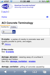
The American Concrete Institue now has a mobile website for their on-the-go users. From the email announcement:
ACI announces mobile.concrete.org, a mobile-optimized version of its website. The mobile.concrete.org site transforms the most popular areas on ACI’s website into a format more convenient for users with mobile devices.
The site is very bare bones, but that's fine for now. I expect it will get more fleshed-out as traffic increases, and I would rather a minimalist, easy-to-load, functional site than a highly designed, flashy, and hard to use one.

ACI's mobile website features a
glossary of important concrete terms.

It is notable that this is coming from ACI, an established and well-entrenched organization, as opposed to some new startup; it shows both how widely adopted mobile web browsing now is, and an understanding that their members are not always at a desk when they need information.

Email Design: Have you seen your email? I haven't.

In a recent episode of the BeanCast, the panel seemed discussed an eMarketer report that found 60% of link forwarding still happens via email. At first they seemed almost surprised by the discovery, but as they discussed it more it came to make sense.

And why not? Email is still the most widespread universal "social" media; universal because even though people are spending more time on social networks now, but while it can be difficult to cross-post something interesting from LinkedIn to Facebook, I can easily send something from my Gmail account to one at AOL, Yahoo, or any custom domain. Which is why good design is crucial to the success of your email campaign.

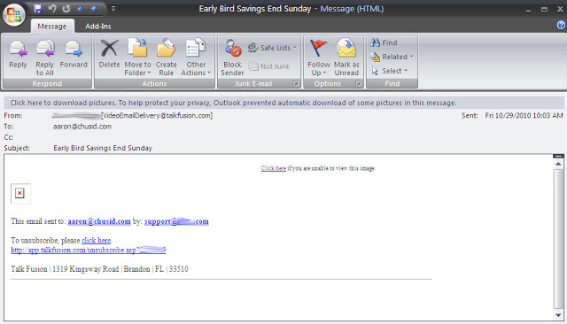
Today I got an email that does several important things right, but got one major piece wrong. Let's take a look at why:

Identifying information has been blurred to protect the innocent
The major problem is, I hope, apparent: the email didn't show up! The entire thing was produced as a single image or Flash movie, so all I got was a little red X where content was supposed to be.

Now obviously this is because I have my Outlook set to not download pictures, but that is a real consideration nowadays. In fairness, though, let's look at what they did right before talking about how to deal with an increasingly privacy and safety-minded email audience.

Most importantly, the "Click here if you are unable to view" message is located right at the top. The email may not have shown up, but I can retrieve it easily enough. There is also a very clear unsubscribe link. Let me stress: THIS IS ESSENTIAL FOR EVERY MARKETING EMAIL YOU SEND. They also had an enticing subject line, although it would have been helpful to tell me what the "Early Bird Savings" were for. 

When I went to view the actual email online, it looked pretty good. Message was clear, links were easy to find, and there was an embedded video to give a "personal" touch of my contact inviting me to come to the show. As they would say on Top Chef, though, I can only judge the meal by what got put on the plate, not what happened in the kitchen, so let's look at the problems.

The email was sent through a distribution company, so the address was not one I recognized (which is why the pictures did not download), but they did make sure to use the name of someone I know in the "From" section, which is why I opened it. I saw this person's name next to "Early Bird Savings" and had a pretty good idea what this would be. On balance, this point almost evens out. Unfortunately, spammers also like to use the name of someone I know next to a strange email address, so this was risky. 

In fact, without the body of the email, there were only two identifying marks in this email; look how little I had to blur out! The link at the bottom was not an identifier, I just blurred it so no one could unsubscribe me. That leaves my contact's name in the "From" line, and a generic, impersonal "support" email address in the footer. Who is "Support"? Do you have "Support" listed as one of your contacts? I don't. So how can this help me identify your email as coming from you?

One other problem with the email: it's not mobile friendly. I read at least half my email through my phone now, and even if the graphic had downloaded (which it wouldn't) or I had clicked on the link, the page it took me to would not have fit on the mobile's screen at a readable size. 

Let's look at how to avoid the main problem now. It is not reasonable to expect people to follow the link in order to read the email. The online version exists as a courtesy and as a safety net, so that if I am interested, or having HTML issues,  I can still get it. But you must act as if anyone that cannot read the email will not read the online version. 

My recommendation, and what we do with our newsletter (By the way, are you a subscriber yet?), is similar to what I would recommend for good web design: the main thrust of your email must be conveyed by plain, lightly formatted (if at all) text. Look at your email. Now look at it again with all graphics and formatting (including color and line breaks) removed. Does it still convey your message? If not, consider a redesign. If you must use graphics be sure to include captions or alt text

In general, think of graphics as the toppings on the sundae of your email; they can add flavor and texture, but without the ice cream it's just nuts!

Moving Beyond the Constraints of the Printed Page

Don't get me wrong, I still love reading from the printed page. There's something about the feel, the smell, the sound of turning page after page, engaging all my senses in the experience, not just processing text. I love that I can absorb the page in many different ways, viewing it as a whole or focusing on a specific section without having to go through a complex set of view-change commands, scroll bars, and magnifying glasses with small plus or minus signs. In my home life, the only time I prefer digital text is for research, where the ability to search, bookmark, copy & paste, and email far outweighs the experience of sensory deprivation.

That said, I was very excited to learn about Amazon's new program, offering novellas on Kindle. Not just because I am a long-time fan of "short stories", as most novellas are packaged nowadays, and serial fiction, but because it represents a deep understanding that e-books, and digital media in general, are more than just the online version of printed material. 

From the press release:
Less than 10,000 words or more than 50,000: that is the choice writers have generally faced for more than a century--works either had to be short enough for a magazine article or long enough to deliver the "heft" required for book marketing and distribution. But in many cases, 10,000 to 30,000 words (roughly 30 to 90 pages) might be the perfect, natural length to lay out a single killer idea, well researched, well argued and well illustrated--whether it's a business lesson, a political point of view, a scientific argument, or a beautifully crafted essay on a current event.
I agree wholeheartedly; I have read plenty of books that should have been several chapters shorter, and countless magazine articles that deserved more space than the editor could give, but until recently any printed material operated under certain constraints inherent in the medium; in this case, the cost of publication.

Between the cost of writing, layout, editing, printing, transportation, and distribution, publishing is expensive. The major forms print media we have today exist because they found ways to operate within that constraint. But digital media removes many of those costs. Writing, editing, and layout remain, but the cost to "print" and distribute is the same for 500 words as for 500,000. Suddenly novellas become a profitable product; you have to charge less, but you also pay the author less so it balances out.

So what does this have to do with building product marketing and why am I so excited?

If you ever want to see me geek out on communication theory, ask me about Media Richness Theory. In short, the richness of a medium is based on the number channels - text, video, audio, touch, nonverbal, etc. - by which the medium can send information. "Richer" is not the same as "better"; in fact, the aim of MRT is to fit the richness of a medium to the task at hand. Phone calls and MP3s both only convey audio data, but they are used for very different purposes. Likewise, there are some tasks well suited to email (reminders about tomorrow's meeting), and some that require face-to-face (proposing to your girlfriend).

And yet many companies insist on making their website and online literature nothing more than digital versions of printed materials.

This causes trouble on two fronts, because you sacrifice the strengths of the webpage, such as a wide variety of information channels and easy navigation between connected concepts, and force it to do something it does badly - display a page of fixed text that's larger than the monitor it's being viewed on. That's like trying to watch an IMAX movie on an iPod, or going to the theater to watch YouTube clips.

For example: a lot of the difficulty in writing effective sales literature for construction products lies in explaining concepts it would be easier to show. Written instructions for a product might fill entire pages, while a demo takes seconds. With digital literature you can actually show it, and you can show it at the right time and in the right place: when your customer needs that information. Why limit your effectiveness by assuming digital plays by the same rules as print?

Kudos to Amazon for having the creativity and insight to realize that.

[H/T ReadWriteWeb]

Greenwash of Week - Office Noise

LogiSon offers sound masking systems to help eliminate unwanted noise in the workplace. But if you click on their website, you will get dosed with a high volume talking head. By the time you have found the turn off sound button, you will have disrupted the quiet productivity of your co-workers.
The person shown above walks into the screen unannounced, creating uninvited noise.

If you are going to sell sound solutions, please don't contribute to the problem by generating unsolicited noise in my office.

Why You Should Ditch the Flash Intro

On a comic listing types of bad websites I found this gem:

That about sums it up. Would you put any impediment outside the door to your store, especially a loud, obnoxious one? Of course not. The only businesses I can think of that do this are car dealerships, furniture stores, and places having "Going Out Of Business Sales". And even then you are not required to interact with the guy dressed like Uncle Sam on stilts; he's just an attention-getting device.

Even worse are the cases where if this guy's not there, because he's on break or something, you can't get in at all. Most people won't spend time looking for an alternate entrance; they just leave and may never return.