How NOT

How NOT to use Flash Drives in Press Kits

It has become popular to use "thumb-size" flash drives in press kits. Having the copy and photos on a thumb drive makes it easy for an editor to transfer the data directly into a story, without having to go onto your website or open a CD.

Thumb drives are also a type of "swag" that will attract the attention of an editor. In the press room at the recent World of Concrete (WOC) trade show, I watched editors browse through press kit to see what was worth the effort of hauling home; press kits with flash drives went right into their goodie bag.

But here are a few pointers about how to do it wrong:

- Not using printed media, too. If you just put a bunch of flash drives on the press room table, your message will not be available to the editor during the trade show. Use your paper literature to motivate the editor to visit your booth and to stimulate buzz at the show.

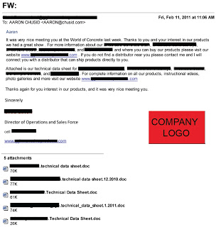
- Not putting editable text on the drive. If you want the editor to run your story, include the press release in a format that the editor can cut and paste. Some of the press kits I saw had pdf files that were locked to prevent text from being copied. What editor will take the time to re-key your article into their word processor?

- Not including an overview sheet on the thumb drive. When I opened one of the flash drives from the trip, all it showed me were file names like:  2450GR, RT24, and 830RT. These may very well be model numbers for new products, but it is off-putting to a busy editor that doesn't know your company well. File names like, "Pervious_Concrete_Admixture" or "New_Sales_Manager" will be more easily understood.

- Not using the color of your brand. Flash drives come in all colors, and can be imprinted in any color. Use colors that support your branding.

- Not printing the name of the company on the data stick. The editor will probably erase your content and reuse the data stick for his or her own purposes. If the name of your company is printed on the face of the drive, at least the drive will continue to provide brand awareness.

- Not including links to your website on the thumb drive. The press release is supposed to be a tease that encourages an editor to go deeper into your story. Put live links into the digital press releases to invite editors to learn the rest of your story.

- Not indicating the name of the trade show. A well formatted press release should have a release date and, if the announcement is being made at a trade show, the show name should be indicated. Yet this information was missing on many of the flash drives I collected.  Compare that to naming the drive "WOC" (instead leaving it named "untitled") and placing downloads inside a folder named, "World of Concrete 2012."

- Not reporting any "News". I attended a press conference where the speaker had poor presentation skills. Afterwards, I asked an editor in attendance what she thought, and she replied that she didn't mind the bad speaker because, "at least he had real news to share." Many press kits just rehash the corporate brand or past glories. It may make the Communications Director feel good, but it is not much value for an editor looking to provide meaningful content to readers.

- Not including press releases: One flash drive was filled with brochures, animations, photos, slide shows, and sales sheets. Perhaps the exertion of putting all that together wore out the PR department, because they didn't include a press release.

- Not putting data on the flash drive. It happens.

The Problem with Communication

“The single biggest problem in communication is 
the illusion that it has taken place.”

- George Bernard Shaw

How NOT to label images

As connection speeds and hard drives have improved, the type of media people look for online has changed. The early 'net was all about text (hypertext), but now people can access, and want, more images. It is neither coincidence or accident that every successful social medium incorporates some form of image sharing. Images are especially important in construction, whether project photos or technical drawings. They illustrate, showcase, and explain products in ways difficult to achieve using just pages full of text and data. This means it is now as important for search engines to find your pictures as your website.

So why do I keep seeing pages that use images like this:


This came from an email newsletter; my email client only downloads images with manual approval, so when I opened the message this is what I saw. The problem is all the images had generic alt text - "Placeholder image" - instead of useful names. 

Usually alt text only comes up when you hover the mouse cursor over an image, but it will also display if, for some reason, the image does not load. This means that if there is no alt text, or bad alt text, and the image is broken or missing, viewers have no way to know what was there. This email would work better if the alt text said, "Rotary hammer in action" or "Vacuum excavator close-up". That text is interesting, and makes me want to click through.

This example comes from an email, not a website, but the basic principal remains the same: Alt text is another way to get readers, and search engines, interested in your images. Adding alt text is fairly easy; most content management systems should provide a space for alt text when you upload an image. If not, it requires a small addition to the HTML that defines the image. Either way, if your webmaster doesn't know how to do this, get a new webmaster.

How NOT to create a Twitter feed

This one is difficult.

When I do these "How NOT to" posts I try very hard to obscure all identifying elements in the source material because my intent in posting is to educate and improve the level of of digital communication, not pick on or smear any particular company. This Twitter feed, however, is very strongly branded - one of the things they did right! - which makes it hard to discuss without revealing their identity. The screen shots will have more redaction than I would usually like, and I may have to be more vague than I would like in the discussion.

On with the post...

As @DesignHousePlan said in a recent webinar about blogging, "[Readers] can get a commercial anywhere; that's not what they come to your blog for." The same is true of Twitter feeds. There is enough advertising already online that if all you ever post are ads for yourself there is no incentive for people to follow you. This means walking a fine line, because if you have no branding or links to your site there is little value to you in using Twitter. The trick is finding the balance between being overly generic and blatantly self-promotional.

Case in point, this morning I was invited to follow this Twitter feed:


As I said, the original is very well designed. They have a distinctive company avatar (which I replaced), good colors, and background on both the company and the person posting, making it personable yet commercial. Their template is slightly mis-sized for the new Twitter format, but I have found it to be much more difficult to design for the new format as it depends so much on the viewer's monitor size, browser window size, etc.

Looking past the design, though, the content is problematic. Every one of their tweets on the front page was of the format, "COMPANY NAME has useful new information at our website." The overall effect, rather than appearing expert and helpful, was very commercial. As in radio commercial; loud, repetitive, and overplayed. I like that they are making use of white papers, but the links all look like they just lead to sales literature, which I had no interest in reading.

Which is really unfortunate, because when I did click through a few more links for research purposes about half actually were useful, objective research papers that I found very interesting. Unfortunately I could not tell which links led to those resources, and which led to their "Contact us for information about our services!" landing page.

If the tweet had been "Learn about the physics behind [Material] in this white paper", I absolutely would have clicked. And so would a lot of architects, engineers, and contractors who like learning about materials and processes on that level. It was the addition of the plug for the company that ruined each tweet.

Branding messages do not need to go in the body of the tweet. You only have 140 characters to work with; better to use them for content. If your profile is set up correctly, the branding will be provided by your screen name, avatar, and home page design. One of the best new Twitter features is that when someone retweets your message it is still identified with your name and logo, with a small message underneath stating who retweeted it. This frees you from the need to include branded content in the tweet, because it will be permanently associated with your name.

Bottom line is this: it is easy to get a lot of followers on Twitter; getting useful, engaged followers is harder. No one turns on the radio to listen to commercials; be sure your tweets are the songs everyone wants to listen to, and not the commercial interruptions.

How NOT to schedule an email

This one's on me.

Recently I was reviewing the analytics on an email campaign we did a while back. I wrote the email, designed the layout, double checked the coding, and it was ready to go. The question then came up, at what time should it be delivered?

The audience was mainly contractors, so I figured it should get to them early, before they start their work day, to have the best chance of getting read. The team agreed; we scheduled it to start mailing at 6:30 AM EST so all the recipients would have it by 7.

If you live in or have done business with the West Coast you probably already see where this is going. See, the email list had not been sorted by time zone. When I got into work and checked my email there was an "unsubscribe" email waiting for me. The message was short, simple, and very instructive:

"3:30 AM emails are NOT cool."

Turns out he keeps his phone near his bed at night, and my email became a pre-sunrise alarm clock, leaving him understandably unhappy.

Lessons Learned

Timing an email across multiple time zones can be challenging; planning an international campaign makes it even more so. If your email client charges based on number of contacts rather than number of campaigns, it is worth the extra effort to schedule each time zone separately. Especially if the subject is time-sensitive, or if you find you get higher open rates at certain times of day.

Problem is, email addresses do not contain any information about time zone; they also do not tell you when your contact is traveling, or if they moved. That means that, despite all your efforts, they might still receive it at the wrong time. Best defense against this, if it is a concern, is to aim for early-midday. Odds of waking up West Coasters are low, but you still catch the East Coast before lunch.

The other important lesson was about how people use their technology. One of the first things I did when I got my iPhone was set it not to check email between midnight and 6 AM. I also turn off all notifications except the ringer during those options because I don't want to be awoken by my insomniac friend's Facebook updates. Not everyone does that, though, either because they have not taken the time to adjust the settings, or because they want to be sure they are reachable in case of emergency.

That represents a change in the way people use email. It took me a while to figure out why this guy was upset about receiving an email at 3:30 AM. In the past it would not have mattered; the email goes to your computer, and you see it when you login in the morning. Now, though, technology is becoming more integrated into our around-the-clock lives.

We, as marketers, benefit from this because it allows us greater access to our customers. We must be respectful of that access, however, because abusing it will anger customers faster than any junk mail, spam, or telemarketer could.

How NOT to post technical data

While looking for photometric information on HID lighting, I visited the website of a major producer. After searching the site for half an hour, I called their technical service line. Their representative was very helpful, and told me where to look on the webpage. When I followed her instructions, I found this:

Names and identifying brand information removed where possible

The text is a little hard to read in this screen shot; it says:
"You have been redirected to http://XXXX/b2c/init.do?shop=GL-L0 in a new browser window. Please continue browsing the XXXX  web site within this browser window." 
What you do not see is the technical information I needed, which means, were I a designer, they would have lost the sale. Why not? Because I use a pop-up blocker when I surf the net. The customer service rep recommended I turn the blocker off to browse their site.

Yeah; right. Let me turn off my virus protection while I'm at it.

Here's the problem: pop-up ads are a type of spam. Not legally, yet, but in terms of how they effect the web browsing experience, and how people react to them. They are also among the easiest types of spam to block; websites usually need to ask permission to open a new window, and pop-up blockers are set to always respond "no".

Not everyone uses pop-up blockers, but the number that do is steadily growing. More importantly, most, if not all, early adopters use them. In other words, the people most likely to be searching for non-established, high-performance new building products.

This is the same problem I have with Flash intros to websites; why are you putting a potential technological barrier between your customer and your product?

The advantage to using a pop-up is site visitors can access new resources without using their place on the current page. This is most useful when the new resource exists outside of your site. For example, if I wanted to show you something on the Concrete Decor Show & Spring Training blog I would set it to open in a new window because I want to share their site but do not want you to leave mine. This lighting company's use of pop-ups does not make sense, because the technical information is still within their website.

Pop-ups are one of those design tools that currently live in a grey area. Using them is not "wrong", but they are annoying enough, poorly used, that it almost does not matter. If you feel your website benefits from using pop-ups sparingly, use them. But never hide important information behind one.

How NOT to comment #2

In response to Steve's recent post on why concrete is not like oatmeal, we received the following comment:
One of the most important aspects of proper concrete placement is the timely use of curing products and procedures. Effective curing is absolutely essential for surface durability
The comment was submitted by "Jared", and there was a link in the phrase "concrete placement" to a seemingly random page on a North Carolina-based contractor's site.

I have a pretty generous internal SPAM filter; I like comments on our blog, so I let a lot of obvious advertisements disguised as comments get through. This one didn't make the cut, and even if it had it would not have done the contractor any good. Here's why:

  1.  The commenter was not properly named. Who is "Jared"? Is he a reliable source of concrete information? If he'd included full name, professional designations, and an email address, he would set himself up as an "expert" on the topic. As is, nothing.
  2. Likewise, there was no mention of the company. Blatant comment advertising is not inherently evil (depending on the venue), but omitting the brand name eliminates any effectiveness it might have had.
  3. There was NO connection between the post and the article it linked to, other than the word "concrete". For that matter, the comment didn't even address the post. This shoots your SEO attempts in the foot by associating your website with the wrong type of material. It also tells me this "Jared" person did not read the post.
  4. I have no idea what the landing page it sent me to was supposed to achieve. It was a poorly designed long block of text about contractor safety. Waste of a click-through. Use designated landing pages, customized to each online campaign. 
  5. The comment itself does not make an effective argument. And definitely fails to make a new one. Tell me something innovative or persuasive; that might get me to click.
Someone paid a digital marketer to write and distribute this comment. Someone wasted their money.

How NOT to send a World of Concrete follow-up email

Oh, where to begin...

Alright, I'll start by saying something nice. I am glad to see this company, unlike many of the ones I spoke to at World of Concrete, bothered to send any follow-up email at all. Even at a small trade show you will make dozens of new contacts; at one the size of WoC that number can easily get into the hundreds. And each of those people you met also made hundreds of new contacts. Meaning the odds of them remembering you are slim unless you do something to make yourself memorable.

Which is why a follow-up email is a good idea. It reaches everyone quickly, sends them to your webpage (or other important destination), and maintains that contact until you have time to reach them personally. I usually tell clients that, in general, any follow-up email is better than none at all.

Then I got this.

Click for large version
The text has been heavily redacted to protect the guilty, but the basic structure and every part I want to discuss are still viewable.


  1. First and foremost, look at the subject line. Yes, the subject to this email, the one that is supposed to convince me to renew my contact and do business with them, is actually "FW:    ".

    This is so bad for so many reasons. Many email systems tag forwards as SPAM, especially if it's coming from someone not in your contact book, has no subject line, or seems to be a commercial message. This hits all three counts. Honestly, I'm a little amazed it even made it to my inbox; I should probably tighten my SPAM filter.

    Worse, though, is the missed opportunity. The subject line is your chance, your only chance, to get the reader's attention. To convince them to open your email, instead of hitting delete. Like the advice given to novelists, you should spend as much time on your subject line as on the rest of your email, if for no other reason than it may be the only piece they read. Even a stock phrase, such as "Thank you for visiting our booth!", would have been better.
  2. The show ended Jan. 21. I received this email Feb. 11. That's three whole weeks! Do you think I still even remember who these people are? The window of opportunity for sending out your post-show email is very small; that's why I recommend prepping the email before you head to the show. If the email is coming this late, it's essentially a digital cold call. Which means it's getting deleted.
  3. It may not show well on this screen shot, but the font in the salutation is a different color than the body text. Ignoring the questionable grammar and business-letter formatting, that tells me instantly this is a form letter, and makes it feel impersonal. 
  4. The writing is bad. Flat out bad. The product names (hidden behind the thick black lines in the body of the text) are dropped in with no description or context, making it awkward and hard to read. And repeated, but again with no context! There is no call-to-action, no incentive, no reason for me to do anything after reading but delete.

    And despite what I said before, grammar counts. Your customers and prospects are very intelligent people; many of them are professional writers of some form. They may not reward you for good grammar, but they will definitely punish you for bad.
  5. The attachments. There are five of them! Six, if you count the company logo graphic! This is a major no-no. Do not send people attachments without their request and their permission. Period. Even if you understood your in-booth conversation with them to be a request for your guide specs, they probably did not.

    If, for some reason, you must send an unsolicited attachment, no more than one, not counting graphics, and nothing over 1 MB. Heavy graphics lowers the permissible file size; remember, they have to be able to get this on their phone. 
  6. There are not enough links. The only link in the whole email is to their homepage. In the second paragraph they mention their photo gallery and instructional videos; why not link directly to those? Why make me hunt for them? I understand not wanting to include product pictures, but at least make them easy to get to.

    Consider carefully where you want your email to take them. I recommend using a dedicated landing page with show-specific information, rather than your standard home page. Our typical follow-up email includes links to subscribe to our newsletter, and visit our Facebook and Twitter pages. Also, be sure to have "Click to view online" and "Click to unsubscribe" links.
They did include their contact information; I removed it, rather than black it all out. I don't know why they thought I needed their mailing address in an email, but they sent it. Also, their logo is much nicer than the big red block makes it look.


I do not have a problem with the minimalist style of the email; simple is good, and this email is almost guaranteed to open easily and display correctly on every system and device. I also like that it is short. No one will read your multi-page follow-up email. If they really want more information they will go to your webpage; make it easy and inviting for them to do so.

In summary, think of these emails like thank-you letters after your birthday. Do them, do them early, and make them nice enough that the recipient wants to send you another present next year.

How NOT to comment

Commenting on blogs, forums, and networking sites is an important part of your online presence. Search engines are likely to find and index your comment, especially if it is on a well-known site, and links you post (when allowed) can send new traffic to your page. More importantly, it shows you and your company are participating in the conversation. But it is important to do it right.

Michael's recent post about white boards received a comment that looks like this:


Anonymous,  December 31, 2010 8:11 AM  


For a whiteboard that stays pure white, check out this glass marker board. Great for the corporate or classroom environment.


I went ahead and published the comment - we post almost every comment we receive, except for the most obvious Spam, but review them first - because it does fit both with the topic of the post (white boards) and the theme of our blog (building products), but this comment fails on several levels to achieve its goals.

1. This was posted by "Anonymous", which does several bad things. Most importantly, it makes me not trust it. Anything I get, via any medium, without a real and recognizable name looks immediately like spam. If it has a real human name I will at least open it, instead of automatically deleting it, but the sender only has 1-2 sentences to get my attention. But this also represents a missed opportunity. Digital marketing is as much about developing your brand as an individual as the company brand; social media is about people, so your personal reputation is what brings people to your company. Posting anonymously is like sending someone a birthday card without signing your name; they want to like you, but do not know who you are.

2. The company or product name does not appear anywhere in the post. There is an art to doing this right, because overusing either makes a comment look like an ad. I recommend following the same guidelines as for a magazine article; focus on the technology and include the name as part of your credentials ("In my work for Chusid Associates, I've found that....").

3. Clicking on the link brings you to a very busy, hard-to-read homepage. Most surfers will get there, look around for 10 seconds, and leave because they cannot find what they want. Instead this should point towards a dedicated landing page, with "Whiteboards that stay pure white!" in big, clear letters. Look for more on landing pages in an upcoming post.

4. This is not a well-written comment. Spelling and grammar are fine, but there is no sense of excitement, no sense of who this is for, no real motivation unless I was already looking for a white board that addresses this topic. That describes a very small part of the architectural market at any given time. If it had said, "See the lated improvement..." or "Learn how we made..." then you draw the much larger audience that does not currently need a white board but is curious about new products. Or better, actually respond to the post; but have an actual response, not a formulaic salutation ("I like what you said about....", not "Great post! Visit....") Also, consider an exclamation point.

I am certain this comment was placed by a automated script; probably no one at the company has ever heard of our blog (too bad for them!). There is nothing wrong with using these scripts, if you use them well. I would recommend setting the script to notify you so you can write a custom response, rather than using a canned message. Anything canned looks like spam, and eventually that will get you in trouble.

Commenting is a very controversial issue right now; there are as many views on the best way to do it as there are digital marketers, and many high-profile blogs forbid including links or have even disabled comments altogether. The general rule everyone agrees on, though, is be polite. You are a guest in someone else's home; if you cannot improve the conversation then stay quiet.