In a recent episode of the BeanCast, the panel seemed discussed an eMarketer report that found 60% of link forwarding still happens via email. At first they seemed almost surprised by the discovery, but as they discussed it more it came to make sense.
And why not? Email is still the most widespread universal "social" media; universal because even though people are spending more time on social networks now, but while it can be difficult to cross-post something interesting from LinkedIn to Facebook, I can easily send something from my Gmail account to one at AOL, Yahoo, or any custom domain. Which is why good design is crucial to the success of your email campaign.
Today I got an email that does several important things right, but got one major piece wrong. Let's take a look at why:
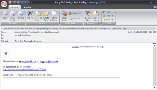 |
| Identifying information has been blurred to protect the innocent |
The major problem is, I hope, apparent: the email didn't show up! The entire thing was produced as a single image or Flash movie, so all I got was a little red X where content was supposed to be.
Now obviously this is because I have my Outlook set to not download pictures, but that is a real consideration nowadays. In fairness, though, let's look at what they did right before talking about how to deal with an increasingly privacy and safety-minded email audience.
Most importantly, the "Click here if you are unable to view" message is located right at the top. The email may not have shown up, but I can retrieve it easily enough. There is also a very clear unsubscribe link. Let me stress: THIS IS ESSENTIAL FOR EVERY MARKETING EMAIL YOU SEND. They also had an enticing subject line, although it would have been helpful to tell me what the "Early Bird Savings" were for.
When I went to view the actual email online, it looked pretty good. Message was clear, links were easy to find, and there was an embedded video to give a "personal" touch of my contact inviting me to come to the show. As they would say on Top Chef, though, I can only judge the meal by what got put on the plate, not what happened in the kitchen, so let's look at the problems.
The email was sent through a distribution company, so the address was not one I recognized (which is why the pictures did not download), but they did make sure to use the name of someone I know in the "From" section, which is why I opened it. I saw this person's name next to "Early Bird Savings" and had a pretty good idea what this would be. On balance, this point almost evens out. Unfortunately, spammers also like to use the name of someone I know next to a strange email address, so this was risky.
In fact, without the body of the email, there were only two identifying marks in this email; look how little I had to blur out! The link at the bottom was not an identifier, I just blurred it so no one could unsubscribe me. That leaves my contact's name in the "From" line, and a generic, impersonal "support" email address in the footer. Who is "Support"? Do you have "Support" listed as one of your contacts? I don't. So how can this help me identify your email as coming from you?
One other problem with the email: it's not mobile friendly. I read at least half my email through my phone now, and even if the graphic had downloaded (which it wouldn't) or I had clicked on the link, the page it took me to would not have fit on the mobile's screen at a readable size.
Let's look at how to avoid the main problem now. It is not reasonable to expect people to follow the link in order to read the email. The online version exists as a courtesy and as a safety net, so that if I am interested, or having HTML issues, I can still get it. But you must act as if anyone that cannot read the email will not read the online version.
My recommendation, and what we do with our newsletter (By the way, are you a subscriber yet?), is similar to what I would recommend for good web design: the main thrust of your email must be conveyed by plain, lightly formatted (if at all) text. Look at your email. Now look at it again with all graphics and formatting (including color and line breaks) removed. Does it still convey your message? If not, consider a redesign. If you must use graphics be sure to include captions or alt text.
In general, think of graphics as the toppings on the sundae of your email; they can add flavor and texture, but without the ice cream it's just nuts!