A recent issue of Architect Magazine had an interesting report on architectural compensation and other practice-related issues. Instead of using conventional bar, line, and pie graphs, the article explored new ways of constructing charts. One of the resulting graphics was even featured on the cover:
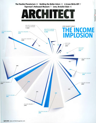
While visually interesting, the graphic is almost impossible to understand. A simple bar graph would have been much easier to read and understand, allowing trends to be identified at a glance. This chart contains data, but it obscures information.
Perhaps one can forgive an art director that wanted to create a cover that would catch the eye. But the charts in the body of the article were equally confusing. This reflects a tension in architectural practice: the drive to create new forms versus the need to create structures that perform well.
 Building product manufacturers and their ad agencies can also experience the same tension. Sometimes, in the drive to create visual excitement, they end up with an ad, website, or brochures that no longer communicates usable information.
For useful guidance on how to create useful charts, I recommend How to Lie with Charts by Gerald Jones, an interesting read and a handy reference in our office.
While visually interesting, the graphic is almost impossible to understand. A simple bar graph would have been much easier to read and understand, allowing trends to be identified at a glance. This chart contains data, but it obscures information.
Perhaps one can forgive an art director that wanted to create a cover that would catch the eye. But the charts in the body of the article were equally confusing. This reflects a tension in architectural practice: the drive to create new forms versus the need to create structures that perform well.
Building product manufacturers and their ad agencies can also experience the same tension. Sometimes, in the drive to create visual excitement, they end up with an ad, website, or brochures that no longer communicates usable information.For useful guidance on how to create useful charts, I recommend How to Lie with Charts by Gerald Jones, an interesting read and a handy reference in our office.